
This is how I picked up my wife… guaranteed to work 60% of the time every time!

This is how I picked up my wife… guaranteed to work 60% of the time every time!

Alex, I’ll take the “best non-PC villains EVAAAAH!” for $1000.
 After reading a lot about reproducible research with R and kntir (and Sweave/LaTeX and R Markdown), I have finally made the commitment to buckle my chin strap and get after it. Knitting my first “minimal” *.Rnw file was easy (thanks to the help of Riccardo Klinger’s most excellent example). In addition, to get quickly up to speed on the coding conventions of LaTeX, Tobi Oetikers document found here will give you just enough to be dangerous–in a good way).
After producing my first report, I quickly ran up against an issue that proved to be a major stumbling block for me. In my work, I find that I often have to produce reports for multiple clients (from the same db) and in those reports, I’m looping over many variables to produce the same plot (e.g., for example displaying trend of units sold by month over all the products in a clients inventory). I did what I normally do in those cases, produce a toy example of my problem and take it to stack overflow, and without fail, my solution (actually 2) were contributed kindly by Ben and Brian Diggs. The recipients of my virtual beer (or other beverage of their choice award) of the week!
As I had the most success with Brian’s code, I offer it up below! Cheers to you both, Brian and Ben!
##  Example *.Rnw File
\documentclass[10pt]{article}
\usepackage[margin=1.15 in]{geometry}
<<loaddata, echo=FALSE, message=FALSE>>=
subgroup <- df[ df$Hospital == hosp,]
@

\begin{document}
<<setup, echo=FALSE >>=
  opts_chunk$set(fig.path = paste("test", hosp , sep=""))
@

Some infomative text about hospital \Sexpr{hosp}

<<plots, echo=FALSE >>=
  for(ward in unique(subgroup$Ward)){
    subgroup2 <- subgroup[subgroup$Ward == ward,]
    #     subgroup2 <- subgroup2[ order(subgroup2$Month),]
    savename <- paste(hosp, ward)
    plot(subgroup2$Month, subgroup2$Outcomes, type="o", main=paste("Trend plot for", savename))
  }
@
\end{document}

## example R file that processes the *.Rnw
##  make my data
Hospital <- c(rep("A", 20), rep("B", 20))
Ward <- rep(c(rep("ICU", 10), rep("Medicine", 10)), 2)
Month <- rep(seq(1:10), 4)
Outcomes <- rnorm(40, 20, 5)
df <- data.frame(Hospital, Ward, Month, Outcomes)

## knitr loop
library("knitr")
for (hosp in unique(df$Hospital)){
  knit2pdf("testingloops.Rnw", output=paste0('report_', hosp, '.tex'))
}

While in most instances it is a much better bet to convert excel data into a *.csv file and use read.csv, there are the rare times when it may actually make sense to grab the data directly out of excel. This is the case (for example) when you have a client who sends you multiple excel files (with multiple sheets per file) that need to be imported.
There are many different packages that do this; however, I kept running into issues as certain packages are only compatible with 32 bit R (or 32 bit Windows), and I run a 64-64 set up. My solution, the gdata package. While it is not very fast (esp for large excel files), you can accomplish the above task with gdata’s read.xls function. In my case the code looks like this:
library(gdata)
DF <- read.xls(xls="~/yourpath/filename.xlsx",sheet=1)
View(DF)
I plan on using a loop (with assign()) to pull in data from 3 sheets in each of many xls files and create the correct names for all of them in R. A word of warning. Each of my sheets contained around 60K rows, and read.xls took quite a bit of time to run an import, so plan accordingly if you are dealing with big files. In my case, system.time() told me that my import of ~65K rows took around 3.5 minutes.
BTW, while this does not warrant a full post, I just recently discovered the function file.choose() for having R create the file path for you (if you happen to be too lazy to type in an actual file name)… or, to put my code above another way, (and if don’t care about looping) you can do something like this:
library(gdata)
DF <- read.xls(xls=file.choose(),sheet=1)
View(DF)
Another example of exploring the limits of your tools…
So what I had to do was use the segment() function to draw my lines. The only problem was that I needed the precise upper and lower coordinates to feed to the segment command. Even though in my case I used a user defined ylim (max and min of y), the plot adds a little bit of a fudge-factor to these upper and lower limits. Enter the usr command. My answer came in the form of this very useful R help posting. The usr option to par() returns a vector of the exact corner limit values of your plotting area (very handy!).
Here is another nice post about the ‘usr’ option to par.
Here’s how it all came together.
##  model of my problem
par(xpd=TRUE)
x <- stats::runif(12); y <- stats::rnorm(12)
i <- order(x, y); x <- x[i]; y <- y[i]
plot(x, y, main = "Notice how the line extends beyond plot margins")
abline(v=0.4)

##  my solution
par(xpd=TRUE)
x <- stats::runif(12); y <- stats::rnorm(12)
i <- order(x, y); x <- x[i]; y <- y[i]
plot(x, y, main = "Notice how the line extends beyond plot margins")
u <- par("usr")
segments(0.4, u[3], 0.4, u[4])

Today, I came across a post from the ‘What you’re doing is rather desperate’ blog that dealt with a common issue, and something that I deal with on (almost) a daily basis. It is, in fact, so common an issue that I have a script that does all the work for me and it was good diving back in for a refresh of something I wrote quite a bit ago.
N.Saunders posts a much cleaner solution than mine, but mine avoids this issues that can arise when you have non-unique values as maximums (or minimums). Plus my solution avoids the use of the merge() function which, in my experience can sometimes be a memory and time hog. See below for my take on solving his issue.
## First lets create some data (and inject some gremlins)
df.orig <- data.frame(vars = rep(LETTERS[1:5], 2), obs1 = c(1:10), obs2 = c(11:20))
df.orig <- rbind(df.orig, data.frame(vars = 'A', obs1 = '6', obs2 = '15'))  ##  create some ties
df.orig <- rbind(df.orig, data.frame(vars = 'A', obs1 = '6', obs2 = '16'))  ##  more ties

df.orig <- df.orig[order(df.orig$vars, df.orig$obs1, df.orig$obs2),]  ##  my solution requires that you order your data first
row.names(df.orig) <- seq(1,nrow(df.orig))  ##  since the row.names get scrambled by the order() function we need to re-establish some neatness
x1 <- match(df.orig$vars, df.orig$vars)
index <- as.numeric(tapply(row.names(df.orig), x1, FUN=tail, n=1)) ## here's where the magic happens
df.max <- df.orig[index,]
I do a lot of work now that involves cutting data out of my company’s SQL database and bringing it directly into R via the RODBC package. It’s a really nice way to tidy up my workflow and by having access to all of the aggregation (and join) functions of SQL, I can do much of the heavy lifting before bringing the data into R. As you can imagine, this really beats the pants off of exporting *.csv tables out of an SQL database and then importing them in (which is what I did until I learned how to use the RODBC package).
Recently my R-RODBC workflow productivity took a bit of a quantum leap as I learned how to incorporate variables that I assign in R directly into an RODBC SQLSelect query. The problem I was confronted with was that, when I go into a database, I often want to cut a years worth (or more) of data by complete months (e.g., I do not want 1/2 a month of data). In cases where the most recent entry leaves you with less than a full month of data on the tail end (or beginning), I needed a way for the select statement to pull data up to the end of the PREVIOUS month (essentially ignoring the hanging chad of the partial month). If, on the other hand, the data just so happened to run up to the last day of a month, I needed the data pull to end on the last day we had data in the SQL database. Because my ‘last day’ was dependent upon what was in the database, I needed a way for R to: 1) Check to see what the last day (most recent entry) was in the data, 2) Evaluate it to see if that last day happened to be an end-of-month value, and 3) Feed the right value into my SQLSelect statement.
The keys to how I implemented this solution involved using the frac option from the as.yearmon function in the zoo package. Once the evaluation was complete, I used if statements to assign the correct first and last date values, and lastly I used the paste function to create my SQL statement, then I had to tidy up the statement using the strwrap function so that it could be fed to RODBCs sqlQuery function. It all goes down like this:
library(zoo)
library(RODBC)
ch <- odbcConnect("THE_DSN_YOU_CREATE")
head(sqlTables(ch), n=20) ## just a test to make sure the connection worked

lastfill <- sqlQuery(ch, "SELECT (MAX(DATE)) AS LASTFILL FROM [YOUR SQL DB]") ## pull the last date

x1 <- as.Date(lastfill[1,1])# pull last fill date as element
x2 <- as.Date(as.yearmon(x1), frac=1) ##  create element for last day of month
x3 <- as.numeric(x2-x1) ##  test, result = 0 if lastfill goes to last day of month


if (x3 > 0){ ##  if lastfill is not at end of month
    lastyearmon <- (as.yearmon(maxyearmon, '%Y%m') - 1/12) ##  The most efficient way for me to cut the data by date is using the "YEAR MONTH" variable in our DB
    firstyearmon <- lastyearmon-(1-(1/12))
}

if (x3 == 0){  ## if last fill IS at end of a month
  lastyearmon <- (as.yearmon(maxyearmon, '%Y%m'))
  firstyearmon <- lastyearmon-(1-(1/12))
}


sql.select <- paste("  ## notice my use of tabs and hard returns to make the statement more legible (highly recommended), we fix these below
                    SELECT
                    *
FROM  [YOUR SQL DB]
WHERE (YEARMONTH>= '", firstyearmon ,"' AND YEARMONTH <= '", lastyearmon, "')", sep="") ##  Simple SQL SELECT statement, but you can get really fancy here if you like.


data <- sqlQuery(ch,
                 strwrap(sql.select, width=nchar(sql.select))) ##  use strwrap to clean up hard returns

close(ch)

I don’t know why I find these twins scary… but I do…
BOTTOM LINE: While I feel quite comfortable extracting elements from data.frame structures, I’m all thumbs when it comes to lists, which is kind of ironic because the data.frame structure is a kind of list…
All that said, I’m a strong believer in the power of confronting fears and addressing ones weaknesses, and today, an occasion presented itself for me to address some of my list-indexing issues. In my example I was using strsplit() to manipulate some string data. What I wanted to do was to extract the third word from a vector of strings where each element contained a name with 2+ words. After doing some hunting around I found this most helpful post that contained a solution, but also provided me with some insight on lists. Enough of that, however, here’s what I ended up doing:
V1 <- c( "Mr. Hooper's Store", "Oscar the Grouchs Can", "Big Bird's Nest" , "Maria's pad", "Elmo's Secret Hideout")
V2 <- sapply(strsplit(V1, " "), function(x) x[3]) ## the result of strsplit is a list
##  this is also insightful
strsplit(V1, " ")[[c(1,3)]]
##  to parse things out, the magic happens with sapply
V3 <- strsplit(V1, " ")
V3
##  let's just change our request to the second word now, just for fun!
sapply(V3, function(x) x[2]) ## magic!
So, what I learned is that to extract specific elements from list structures, I’m going to have to lean on looping constructs and helpful R-ish loop-like functions (of the apply-ilk) to get what I want.
I recently ran into a problem where I was writing some plot code to run reports from a database that contained many different observations within a field across many clients. For example let’s say you wanted to run plots of unit sales data from all the Vendors that sold goods to each of your clients. One client’s vendor list may include: StoreX and StoreY, while another client’s list may only include StoreX, StoreZ, and StoreA. This became an issue because I needed the plot code to call certain variables by name AFTER a call to dcast, and the dcast call created variable names that were customized according to the observations in the field of interest by client. That is to say, sometimes you’d get DF$StoreX and DF$StoreY and in other cases, DF$StoreX, DF$StoreZ and DF$StoreA.
So you see, the crux of my problem was that I did not know what these variables were going to be named before the plot code was to call them, a side effect of using dcast to reshape my dataframe
After some searching around for an answer, I stumbled across the assign() function in base R, and after some experimenting I came up with a solution to my problem!
While my example may still seem pretty clunky and it uses a dummy data set with very few Vendors, you can imagine a situation where the Vendor list is long and includes a large number of possible groupings by client.
structure(list(yearmon = structure(c(2012.08333333333, 2012.25,
2012.33333333333, 2012.5, 2012.58333333333, 2012.66666666667,
2012.83333333333, 2012.16666666667, 2012.41666666667, 2012.75,
2011.58333333333, 2011.66666666667, 2011.41666666667, 2011.5,
2011.91666666667, 2012, 2011.75, 2011.83333333333, 2011.41666666667,
2011.5, 2011.66666666667, 2012.41666666667, 2012.5, 2012.58333333333,
2012.66666666667, 2011.58333333333, 2011.75, 2011.83333333333,
2011.91666666667, 2012, 2012.08333333333, 2012.16666666667, 2012.25,
2012.33333333333, 2012.75, 2012.83333333333), class = "yearmon"),
    Vendor = c("Vendor1", "Vendor1", "Vendor1", "Vendor1", "Vendor1",
    "Vendor1", "Vendor1", "Vendor1", "Vendor1", "Vendor1", "Vendor1",
    "Vendor1", "Vendor1", "Vendor1", "Vendor1", "Vendor1", "Vendor1",
    "Vendor1", "Vendor2", "Vendor2", "Vendor2", "Vendor2", "Vendor2",
    "Vendor2", "Vendor2", "Vendor2", "Vendor2", "Vendor2", "Vendor2",
    "Vendor2", "Vendor2", "Vendor2", "Vendor2", "Vendor2", "Vendor2",
    "Vendor2"), units = c(14912, 15060, 15406, 14995, 15391,
    20069, 15789, 15445, 14921, 15586, 14522, 15679, 15157, 14226,
    16667, 15750, 14798, 15464, 33161, 31238, 39159, 32259, 33710,
    36358, 42586, 34580, 34411, 34494, 39398, 31233, 33453, 34703,
    33238, 34309, 34150, 33644)), .Names = c("yearmon", "Vendor",
"units"), row.names = c(NA, 36L), class = "data.frame")

names <- unique(df1$Vendor)[order(unique(df1$Vendor))]
library(reshape2)
df1 <- dcast(df1, yearmon~Vendor, value.var='units')
df1[is.na(df1)] <- 0
df1$total <- rowSums(df1[unique(names)])

nameindex <- grep(paste(names, collapse="|"), names(df1))  ##  create index only for columns rep DTE pharmacies
ornamevec <- gsub('-| ', '', unique(names)) ## to clean up any troublesome characters that may have been coded into the Vendor names
names(df1)[nameindex] <- ornamevec ## change var names to remove strange characters

namevec <- NA
for(i in 1:length(unique(names))){
  j <- nameindex[i]
  nam <- paste('pct', ornamevec[i], sep='')
  xx1 <- assign(nam, round((df1[j]/df1$total)*100, 2)) ## the magic happens here
  names(xx1) <- nam
  namevec[i] <- nam ## create vector of newly created columns
  df1 <- cbind(df1, xx1)
}
newnameindex <- grep(paste(namevec, collapse="|"), names(df1))


par(mar=c(5.1, 4.1, 4.1, 9.2), xpd=TRUE)
ymax <-  max( df1[c(ornamevec)])+(0.1* max( df1[c(ornamevec)]))
ymin <-  min( df1[c(ornamevec)])+(0.1* min( df1[c(ornamevec)]))
library(RColorBrewer)
cpal <- brewer.pal(length(ornamevec), 'Set2')
plot( df1$yearmon, df1$yearmon,yaxt='n', xaxt='n', ylab="", xlab="")
u <- par("usr")
rect(u[1], u[3], u[2], u[4], col = "gray88", border = "black")
par(new=T)
for (i in 1:length(ornamevec)){
  j <- nameindex[i] ##  calls variable to be plotted
  plot( df1$yearmon, df1[,j], type="o", col=cpal[i], lwd=2, lty=i,yaxt='n', cex.axis=.7, cex.sub=.8, cex.lab=.8, xlab= 'Month', ylab='Units (1,000s)', main=paste('Units by Vendor by Month'), ylim=c(ymin,ymax), sub=paste('' ), cex.sub=.8)
  if (i < length(ornamevec))
    par(new=T)
}
axis(side=2, at= pretty(c(ymin, (ymax-(.1*(ymax-ymin))))), labels=format( pretty(c(ymin, (ymax-(.1*(ymax-ymin)))))/1000, big.mark=','), cex.axis=.75)
legend('right', inset=c(-0.18,0), legend=ornamevec, lwd=rep(2, length(names)), pchrep(1, length(names)), col=cpal, lty= 1:length(ornamevec) ,title="LEGEND", bty='n' , cex=.8)
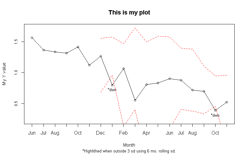
The resulting plot looks like this.

I recently was tasked with putting together a dashboard of sorts that provided some visualizations that made it easy for users to see when values were ‘outside of what might be expected.’ My first stab at a deliverable included plots that looked backward at a range of values to set a band of ‘likely’ values, and identified points that fell outside of that range. As I had some flexibility, I chose to use standard deviations to define my ranges, and I looked back over the previous rolling 6 months worth of values to set my bands. The code is written in such a way that I can change both the look back and the factor that’s applied to the SD (to create the bands).
The code required I make use of the helpful rollapply() function in the zoo package.
library(zoo)
data <- structure(list(yearmon = structure(c(2011.41666666667, 2011.5,
                                             2011.58333333333, 2011.66666666667, 2011.75, 2011.83333333333,
                                             2011.91666666667, 2012, 2012.08333333333, 2012.16666666667, 2012.25,
                                             2012.33333333333, 2012.41666666667, 2012.5, 2012.58333333333,
                                             2012.66666666667, 2012.75, 2012.83333333333), class = "yearmon"),
                       pct = c(1.565, 1.365, 1.335, 1.315, 1.415, 1.12, 1.265, 0.8,
                               1.065, 0.555, 0.81, 0.835, 0.9, 0.88, 0.72, 0.7, 0.39, 0.525
                               )), .Names = c("yearmon", "pct"), class = "data.frame", row.names = c(NA,
                                                                                                     18L))

lookback <- 6
sdlim <- 3


c <- zoo(data$pct)
rollsd <- c( rep(NA,lookback-1), rollapply(c, 6, sd, align = 'right'))
x1 <- as.data.frame(cbind(data$pct, rollsd*sdlim))
x1 <- cbind(yearmon = data$yearmon, x1)
x1$upest <- c(rep(NA,lookback) ,x1$V1[(lookback):(length(x1$V1)-1)] + x1$V2[lookback:(length(x1$V1)-1)])
x1$dwnest <- c(rep(NA,lookback) ,x1$V1[(lookback):(length(x1$V1)-1)] - x1$V2[lookback:(length(x1$V1)-1)])
x1$test <- ifelse(x1$V1 > x1$upest, "*up", NA)
x1$test <- ifelse(x1$V1 < x1$dwnest, "*dwn", x1$test)
x1$testup <- ifelse(x1$V1 > x1$upest, "*up", NA)
x1$testdwn <- ifelse(x1$V1 < x1$dwnest, "*dwn", NA)
x1$testup <- ifelse(is.na(x1$testup), "", x1$testup)
x1$testdwn <- ifelse(is.na(x1$testdwn), "", x1$testdwn)
ymax <- max(x1$V1)+(0.1*(max(x1$V1)))
ymin <- (min(x1$V1)) - (0.1*(max(x1$V1)))

par(mar = c(6.1, 4.1 , 4.1, 2.1))

plot( x1$yearmon, x1$yearmon, type="n", lwd=2,yaxt='n', xaxt='n', ylab="", xlab="")
u <- par("usr")
rect(u[1], u[3], u[2], u[4], col = "gray88", border = "black")
par(new=T)
plot( x1$yearmon, x1$V1, type="o", yaxt='n', cex.sub=.8, cex.lab=.95, xlab= 'Month', ylab='My Y value', main='This is my plot', ylim=c(ymin,ymax))
abline(h = pretty(ymin:ymax), col='white') ##  draw h lines
abline(v = (x1$yearmon), col='white') ##  draw v lines
par(new=T)
plot( x1$yearmon, x1$V1, type="o", yaxt='n', cex.sub=.8, cex.lab=.95, xlab= 'Month', ylab='My Y value', main='This is my plot', ylim=c(ymin,ymax))
xtail <- tail(x1, n=12)
new <- data.frame(yearmon=xtail$yearmon) ##  dummy dataset for prediction line
lines(new$yearmon, predict(lm(xtail$V1~xtail$yearmon), new), col='blue', lty=3, lwd=2)  ##  draws line onlty throught the last 12 mos
tests <- summary(lm(xtail$V1~xtail$yearmon))
pval <- round(tests[[4]][2,4],3)

title(sub = paste('*Highlighted when outside', sdlim, 'sd using', lookback, 'mo. rolling sd.\n', avg12mo, "OLS p-value= ", pval), line = 4.5, cex.sub=.75)
axis(side=2, at=pretty(c(ymin, ymax)), labels=format(pretty(c(ymin, ymax)), big.mark=','), cex.axis=.75)
par(new=T)
plot( x1$yearmon, x1$upest, type="l", lty=2 ,ylim=c(ymin,ymax), xaxt='n', yaxt='n', xlab="", ylab="",cex.sub=.8,  col='red')
par(new=T)
plot( x1$yearmon, x1$dwnest, type="l", lty=2  ,ylim=c(ymin,ymax), xaxt='n', yaxt='n', xlab="", ylab="",cex.sub=.8, col='red')
text(x1$yearmon, x1$V1, x1$testup, pos=3, offset=.5,cex=.8)
text(x1$yearmon, x1$V1, x1$testdwn, pos=1, offset=.5,cex=.8)
I’m sure there is some cleaning up I could do to make the code more compact (nested ifelse statements come to mind), but I am trying to make sure the code is very readable at this stage.
