
The one-and-only Figure 4. from LaRossa et al.
VS.

Statins… Saving lives since 1987.
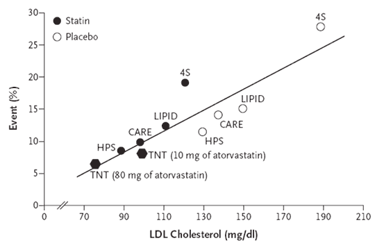
What you are looking at is quite possibly the most replicated statin study data visualization of all time. If you have been to more than one lecture on either primary-or-secondary prevention with statins, you’ve seen this plot, or some adaptation. It comes from page 1434 of the New England Journal of Medicine volume 352, issue 14. It was used in the discussion section by the authors of the TNT trial (LaRosa et al. N Engl J Med. 2005 Apr 7;352(14):1425-35.) to put the results of TNT into the broader context of the extant secondary prevention literature of the day. I’ve been thinking a lot about these data recently (for reasons which I’ll leave for another post), and wanted to manipulate some of it in R, and as a part of that exercise I decided to re-create (as best I could using only data form the published trials) and perhaps improve upon the plot.
options(stringsAsFactors=F, scipen=999)
library(ggplot2)
library(RColorBrewer)
file <- "http://dl.dropboxusercontent.com/u/27644144/secprevstatin.csv" # data is here--I extracted it the best I could from the various landmark trials
statins <- read.csv(file, header=T)
#View(secprevstatin)

##  slightly tweaked (I think this just looks better)

df1 <- statins
yval <- 'eventrate'
pyval <- 'Event (%)'
xval <- 'LDL'
pxval <- 'LDL Cholesterol (mg/dL)'

##  slightly tweaked (I think this just looks better)
par(mar=c(5.1, 4.1, 4.1, 12))
df1$pchvec <- ifelse( grepl("PBO", df1$Cohort), 1, 19 )
plot( df1[, xval], df1[, yval], type="n", ylim=c(0,30), xlim=c(40,210), yaxt='n', xaxt='n', ylab="", xlab="")
u <- par("usr")
rect(u[1], u[3], u[2], u[4], col = "grey95", border = "black")
par(new=T)
abline(h = c(0, 5, 10, 15, 20, 25, 30), col='white', lwd=2) ##  draw h lines
abline(v = c(50,70, 90, 110, 130, 150, 170, 190, 210), col='white', lwd=2) ##  draw v lines
par(new=T)
plot( df1[, xval], df1[, yval], pch=df1$pchvec, col= cpal , bg= df1$pchfill, cex=1.5  ,yaxt='n', xaxt='n', ylab="", xlab="", ylim=c(0,30), xlim=c(40,210), lwd=2)
axis(side=2, at=c(0, 5, 10, 15, 20, 25, 30), labels=c("0","5",'10', '15', '20', '25', '30'), las=1 )
axis(side=1, at=c(50, 70, 90, 110, 130, 150, 170, 190, 210), labels=c("50" , "70", "90", "110", "130", "150", "170", "190", "210")  )
legend( "topleft", pch=c(19, 1), legend=c("Statin", "Placebo"), cex=1.2, border= "n", bty='n')
text(df1[, xval], df1[, yval], labels = df1$Study, pos = 3, font=2, col=cpal)
title(main="Figure 4. Event Rates Plotted against LDL Cholesterol Levels\nduring Statin Therapy in Secondary-Prevention Studies.", ylab=pyval, xlab=pxval)
abline(lm(df1$eventrate~df1$LDL), lwd=2)
poly.plot <- lm(eventrate~poly(LDL, 2), data=df1)
poly.pred <- predict(poly.plot, df1[xval])
preddf <- data.frame(x = df1[,xval], y=poly.pred)
preddf <- preddf[ order(preddf$x),]
lines(x=preddf$x, y=preddf$y, type="l", col="red", lwd=3, lty=2)
