I recently ran into a problem where I was writing some plot code to run reports from a database that contained many different observations within a field across many clients. For example let’s say you wanted to run plots of unit sales data from all the Vendors that sold goods to each of your clients. One client’s vendor list may include: StoreX and StoreY, while another client’s list may only include StoreX, StoreZ, and StoreA. This became an issue because I needed the plot code to call certain variables by name AFTER a call to dcast, and the dcast call created variable names that were customized according to the observations in the field of interest by client. That is to say, sometimes you’d get DF$StoreX and DF$StoreY and in other cases, DF$StoreX, DF$StoreZ and DF$StoreA.
So you see, the crux of my problem was that I did not know what these variables were going to be named before the plot code was to call them, a side effect of using dcast to reshape my dataframe
After some searching around for an answer, I stumbled across the assign() function in base R, and after some experimenting I came up with a solution to my problem!
While my example may still seem pretty clunky and it uses a dummy data set with very few Vendors, you can imagine a situation where the Vendor list is long and includes a large number of possible groupings by client.
structure(list(yearmon = structure(c(2012.08333333333, 2012.25,
2012.33333333333, 2012.5, 2012.58333333333, 2012.66666666667,
2012.83333333333, 2012.16666666667, 2012.41666666667, 2012.75,
2011.58333333333, 2011.66666666667, 2011.41666666667, 2011.5,
2011.91666666667, 2012, 2011.75, 2011.83333333333, 2011.41666666667,
2011.5, 2011.66666666667, 2012.41666666667, 2012.5, 2012.58333333333,
2012.66666666667, 2011.58333333333, 2011.75, 2011.83333333333,
2011.91666666667, 2012, 2012.08333333333, 2012.16666666667, 2012.25,
2012.33333333333, 2012.75, 2012.83333333333), class = "yearmon"),
    Vendor = c("Vendor1", "Vendor1", "Vendor1", "Vendor1", "Vendor1",
    "Vendor1", "Vendor1", "Vendor1", "Vendor1", "Vendor1", "Vendor1",
    "Vendor1", "Vendor1", "Vendor1", "Vendor1", "Vendor1", "Vendor1",
    "Vendor1", "Vendor2", "Vendor2", "Vendor2", "Vendor2", "Vendor2",
    "Vendor2", "Vendor2", "Vendor2", "Vendor2", "Vendor2", "Vendor2",
    "Vendor2", "Vendor2", "Vendor2", "Vendor2", "Vendor2", "Vendor2",
    "Vendor2"), units = c(14912, 15060, 15406, 14995, 15391,
    20069, 15789, 15445, 14921, 15586, 14522, 15679, 15157, 14226,
    16667, 15750, 14798, 15464, 33161, 31238, 39159, 32259, 33710,
    36358, 42586, 34580, 34411, 34494, 39398, 31233, 33453, 34703,
    33238, 34309, 34150, 33644)), .Names = c("yearmon", "Vendor",
"units"), row.names = c(NA, 36L), class = "data.frame")

names <- unique(df1$Vendor)[order(unique(df1$Vendor))]
library(reshape2)
df1 <- dcast(df1, yearmon~Vendor, value.var='units')
df1[is.na(df1)] <- 0
df1$total <- rowSums(df1[unique(names)])

nameindex <- grep(paste(names, collapse="|"), names(df1))  ##  create index only for columns rep DTE pharmacies
ornamevec <- gsub('-| ', '', unique(names)) ## to clean up any troublesome characters that may have been coded into the Vendor names
names(df1)[nameindex] <- ornamevec ## change var names to remove strange characters

namevec <- NA
for(i in 1:length(unique(names))){
  j <- nameindex[i]
  nam <- paste('pct', ornamevec[i], sep='')
  xx1 <- assign(nam, round((df1[j]/df1$total)*100, 2)) ## the magic happens here
  names(xx1) <- nam
  namevec[i] <- nam ## create vector of newly created columns
  df1 <- cbind(df1, xx1)
}
newnameindex <- grep(paste(namevec, collapse="|"), names(df1))


par(mar=c(5.1, 4.1, 4.1, 9.2), xpd=TRUE)
ymax <-  max( df1[c(ornamevec)])+(0.1* max( df1[c(ornamevec)]))
ymin <-  min( df1[c(ornamevec)])+(0.1* min( df1[c(ornamevec)]))
library(RColorBrewer)
cpal <- brewer.pal(length(ornamevec), 'Set2')
plot( df1$yearmon, df1$yearmon,yaxt='n', xaxt='n', ylab="", xlab="")
u <- par("usr")
rect(u[1], u[3], u[2], u[4], col = "gray88", border = "black")
par(new=T)
for (i in 1:length(ornamevec)){
  j <- nameindex[i] ##  calls variable to be plotted
  plot( df1$yearmon, df1[,j], type="o", col=cpal[i], lwd=2, lty=i,yaxt='n', cex.axis=.7, cex.sub=.8, cex.lab=.8, xlab= 'Month', ylab='Units (1,000s)', main=paste('Units by Vendor by Month'), ylim=c(ymin,ymax), sub=paste('' ), cex.sub=.8)
  if (i < length(ornamevec))
    par(new=T)
}
axis(side=2, at= pretty(c(ymin, (ymax-(.1*(ymax-ymin))))), labels=format( pretty(c(ymin, (ymax-(.1*(ymax-ymin)))))/1000, big.mark=','), cex.axis=.75)
legend('right', inset=c(-0.18,0), legend=ornamevec, lwd=rep(2, length(names)), pchrep(1, length(names)), col=cpal, lty= 1:length(ornamevec) ,title="LEGEND", bty='n' , cex=.8)
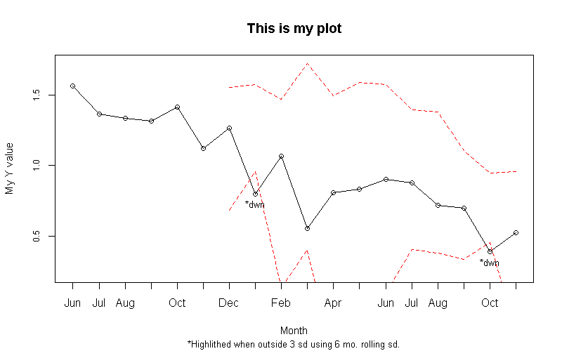
The resulting plot looks like this.