
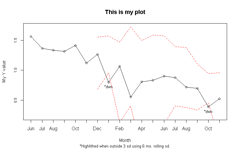
I recently was tasked with putting together a dashboard of sorts that provided some visualizations that made it easy for users to see when values were ‘outside of what might be expected.’ My first stab at a deliverable included plots that looked backward at a range of values to set a band of ‘likely’ values, and identified points that fell outside of that range. As I had some flexibility, I chose to use standard deviations to define my ranges, and I looked back over the previous rolling 6 months worth of values to set my bands. The code is written in such a way that I can change both the look back and the factor that’s applied to the SD (to create the bands).
The code required I make use of the helpful rollapply() function in the zoo package.
library(zoo)
data <- structure(list(yearmon = structure(c(2011.41666666667, 2011.5,
                                             2011.58333333333, 2011.66666666667, 2011.75, 2011.83333333333,
                                             2011.91666666667, 2012, 2012.08333333333, 2012.16666666667, 2012.25,
                                             2012.33333333333, 2012.41666666667, 2012.5, 2012.58333333333,
                                             2012.66666666667, 2012.75, 2012.83333333333), class = "yearmon"),
                       pct = c(1.565, 1.365, 1.335, 1.315, 1.415, 1.12, 1.265, 0.8,
                               1.065, 0.555, 0.81, 0.835, 0.9, 0.88, 0.72, 0.7, 0.39, 0.525
                               )), .Names = c("yearmon", "pct"), class = "data.frame", row.names = c(NA,
                                                                                                     18L))

lookback <- 6
sdlim <- 3


c <- zoo(data$pct)
rollsd <- c( rep(NA,lookback-1), rollapply(c, 6, sd, align = 'right'))
x1 <- as.data.frame(cbind(data$pct, rollsd*sdlim))
x1 <- cbind(yearmon = data$yearmon, x1)
x1$upest <- c(rep(NA,lookback) ,x1$V1[(lookback):(length(x1$V1)-1)] + x1$V2[lookback:(length(x1$V1)-1)])
x1$dwnest <- c(rep(NA,lookback) ,x1$V1[(lookback):(length(x1$V1)-1)] - x1$V2[lookback:(length(x1$V1)-1)])
x1$test <- ifelse(x1$V1 > x1$upest, "*up", NA)
x1$test <- ifelse(x1$V1 < x1$dwnest, "*dwn", x1$test)
x1$testup <- ifelse(x1$V1 > x1$upest, "*up", NA)
x1$testdwn <- ifelse(x1$V1 < x1$dwnest, "*dwn", NA)
x1$testup <- ifelse(is.na(x1$testup), "", x1$testup)
x1$testdwn <- ifelse(is.na(x1$testdwn), "", x1$testdwn)
ymax <- max(x1$V1)+(0.1*(max(x1$V1)))
ymin <- (min(x1$V1)) - (0.1*(max(x1$V1)))

par(mar = c(6.1, 4.1 , 4.1, 2.1))

plot( x1$yearmon, x1$yearmon, type="n", lwd=2,yaxt='n', xaxt='n', ylab="", xlab="")
u <- par("usr")
rect(u[1], u[3], u[2], u[4], col = "gray88", border = "black")
par(new=T)
plot( x1$yearmon, x1$V1, type="o", yaxt='n', cex.sub=.8, cex.lab=.95, xlab= 'Month', ylab='My Y value', main='This is my plot', ylim=c(ymin,ymax))
abline(h = pretty(ymin:ymax), col='white') ##  draw h lines
abline(v = (x1$yearmon), col='white') ##  draw v lines
par(new=T)
plot( x1$yearmon, x1$V1, type="o", yaxt='n', cex.sub=.8, cex.lab=.95, xlab= 'Month', ylab='My Y value', main='This is my plot', ylim=c(ymin,ymax))
xtail <- tail(x1, n=12)
new <- data.frame(yearmon=xtail$yearmon) ##  dummy dataset for prediction line
lines(new$yearmon, predict(lm(xtail$V1~xtail$yearmon), new), col='blue', lty=3, lwd=2)  ##  draws line onlty throught the last 12 mos
tests <- summary(lm(xtail$V1~xtail$yearmon))
pval <- round(tests[[4]][2,4],3)

title(sub = paste('*Highlighted when outside', sdlim, 'sd using', lookback, 'mo. rolling sd.\n', avg12mo, "OLS p-value= ", pval), line = 4.5, cex.sub=.75)
axis(side=2, at=pretty(c(ymin, ymax)), labels=format(pretty(c(ymin, ymax)), big.mark=','), cex.axis=.75)
par(new=T)
plot( x1$yearmon, x1$upest, type="l", lty=2 ,ylim=c(ymin,ymax), xaxt='n', yaxt='n', xlab="", ylab="",cex.sub=.8,  col='red')
par(new=T)
plot( x1$yearmon, x1$dwnest, type="l", lty=2  ,ylim=c(ymin,ymax), xaxt='n', yaxt='n', xlab="", ylab="",cex.sub=.8, col='red')
text(x1$yearmon, x1$V1, x1$testup, pos=3, offset=.5,cex=.8)
text(x1$yearmon, x1$V1, x1$testdwn, pos=1, offset=.5,cex=.8)
I’m sure there is some cleaning up I could do to make the code more compact (nested ifelse statements come to mind), but I am trying to make sure the code is very readable at this stage.
