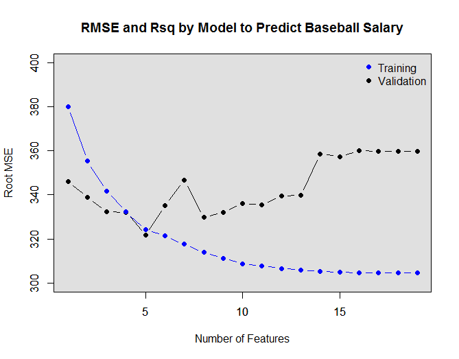
Curating data to eliminate partial quarters, months (of even years if that’s your game)…

Step 1: Insert data, Step2: collect money... If it were only that simple...

Step 1: Insert data, Step2: collect money… If it were only that simple…

Often, I’m pulling data in to R from datasets that are updated monthly; however, there are many cases where I am interested in aggregating data by quarters. In these cases I need to make sure that in each aggregation bin, the data represent full quarters (and full months as well–but I tacked that in an earlier post).

Most of the time I use RODBC to bring my data from our warehouse into R, and I suppose you could implement the technique below as part of the data import step, but in this particular case, I implemented the code below after the data had been imported into r.

## simulate some data

library(zoo)
n <- 100
date <- seq(as.Date('2011-01-01'),as.Date('2012-04-30'),by = 1)
values <- rnorm(length(date), n, 25)
df1 <- data.frame(date, values)
df1$yrqtr <- as.yearqtr(df1$date)
df1$yrmon <- as.yearmon(df1$date)

tapply(df1$values, df1$yrqtr, sum) # beware the last quarter is incomplete
range(df1$yrqtr) #you can't tell by looking here
range(df1$yrmon) #but you can tell by looking here


# this code fixes your problem
test1 <- as.yearmon(as.Date(max(df1$yrqtr), frac=1)) ## returns the last month of the last QTR that we have data for
result1 <- as.yearmon(as.Date(max(df1$yrqtr), frac=0)) ##  returns the FIRST month ofthe last QTR what we have data for
#if max yearmon in data is not equal to what should be the last yearmon for the last qtr in data
# cut  data to last full quarter 
if(max(df1$yrmon) != test1)
  df1 <- df1[ df1$yrmon < result1 , ]

tapply(df1$values, df1$yrqtr, sum) # this is more like it!
range(df1$yrqtr)  
range(df1$yrmon) 

Advertisement

Evaluating across many columns within the same row to extract the first occurrence of a string

Does your job make you feel like this sometimes?? Yup, me too!

Does your job make you feel like this sometimes?? Yup, me too!

Some time ago I was tasked with looking at a set of claims data to pull only claim lines that had a certain diagnosis, and even more importantly, if there were claims where multiple diagnoses were listed, I needed to pull only the “most important” (let’s just call it that). It is not the purpose of this post to debate the consideration of attributing a weighting to the importance of a diagnoses based on the order of appearance in the claim files after the first position, so let’s not even go there. This is just more about applying a method that may have application in a more broader context.

For those of you who may not be familiar, the claim files that I had listed (for each Patient and Service Date) a series of fields indicating different diagnoses (e.g., Principal Diagnosis, Diagnosis Code 2, Diagnosis Code 3). The condition that I was tasked with looking into was made up of a composite of diagnosis codes, and in some cases a patient may have one of the diagnoses codes (making up the composite) in position #1, and another in position #2 (or even position #3). However, we did not want to count patients more than once for each claim line. Rather, we wanted to pull forward the first diagnosis (matching any in the composite set) as we “looked” at the set of diagnoses code columns, working our way down Diagnosis Code Principal, then Diagnosis code #2, and #3.

Enough of the background, it is better to just show you what is going on with some code…

One last note, I used a looping construct in this version of my solution. Recently, I think I’ve stumbled on a way to do the same with one of the apply family of functions.

set.seed(1234)
options(stringsAsFactors=FALSE)

# simulate some data
Diagnosis_Code_Principal <- sample(c("heart attack", "unstable angina", "broken arm", "stomach ache", "stubbed toe", "ingrown hair", "tooth ache"), 1000, replace=TRUE)
Diagnosis_Code_02 <- sample(c("heart attack", "unstable angina", "broken arm", "stomach ache", "stubbed toe", "ingrown hair", "tooth ache"), 1000, replace=TRUE)
Diagnosis_Code_03 <- sample(c("heart attack", "unstable angina", "broken arm", "stomach ache", "stubbed toe", "ingrown hair", "tooth ache"), 1000, replace=TRUE)
Service_Date_MMDDYYYY <- sample( seq.Date(as.Date("2011/1/1"), as.Date("2011/12/31"), by="day"), 1000, replace=TRUE)
Person_ID <- sample( c("Person1", "Person2", "Person3", "Person4"),1000, replace=TRUE)
eventdata <- data.frame(Person_ID, Service_Date_MMDDYYYY,Diagnosis_Code_Principal, Diagnosis_Code_02, Diagnosis_Code_03)
eventdata <- eventdata[ order(eventdata$Person_ID, eventdata$Service_Date_MMDDYYYY), ]

keydx <- c("heart attack|unstable angina") # these are the "codes" that make up our composite 

eventdata <- unique(eventdata)## duplicate lines are uninformative

eventdata$keep <- grepl((keydx), eventdata$Diagnosis_Code_Principal) | grepl((keydx), eventdata$Diagnosis_Code_02) | grepl((keydx), eventdata$Diagnosis_Code_03) ## more slimming down of the data
eventdata <- eventdata[ eventdata$keep == TRUE, ] 


##  creates a vector where the first match is returned from a set of columns string
firstdx <- rep(0, nrow(eventdata))
for(i in 1:nrow(eventdata)){
  a <- rep(0,3)
  a <- c(eventdata[i, "Diagnosis_Code_Principal"], eventdata[i, "Diagnosis_Code_02"], eventdata[i, "Diagnosis_Code_03"])## you can list as many columns as you like.
  if (any(grepl(keydx, a)))
    b <- a[grep(keydx, a)[1]] # keydx is listing of ICD9s that match dx grouping you are interested in
  if (!any(grepl(keydx, a))) ##  takes care of any cases where there is no match
    b <- NA      
  firstdx[i] <- b
}
eventdata$firstdx <- firstdx ## add the firstdx column to the dataset


Hacking base R plot code to do what facet does in ggplot2… Going about things the hard way

Another demonstration of doing things the hard way

Another demonstration of doing things the hard way


Rplot07
I have waffled back-and-forth from base plotting to ggplot2 back to base plotting for my every day plotting needs. Mainly, this is because when it comes to customization of all aspects of the plot (esp. the legend) I feel more more in command with the base R plotting code. That said, one of the great benefits of ggplot is efficiency and how the package allows users to do quite a lot with very few lines. I certainly still find ggplot2 to be a very handy package!
One of these killer features is the facet option. To achieve something similar with base R takes quite a bit of code to achieve (as far as I can tell), and while I have managed to hackishly create my own base plot work-around, it certainly is far from elegant.

df1 <- structure(list(yearmon = structure(c(1962.66666666667, 1962.75, 
1962.83333333333, 1962.91666666667, 1963, 1963.08333333333, 1963.16666666667, 
1963.25, 1963.33333333333, 1963.41666666667, 1963.5, 1963.58333333333, 
1962.66666666667, 1962.75, 1962.83333333333, 1962.91666666667, 
1963, 1963.08333333333, 1963.16666666667, 1963.25, 1963.33333333333, 
1963.41666666667, 1963.5, 1963.58333333333, 1962.66666666667, 
1962.75, 1962.83333333333, 1962.91666666667, 1963, 1963.08333333333, 
1963.16666666667, 1963.25, 1963.33333333333, 1963.41666666667, 
1963.5, 1963.58333333333), class = "yearmon"), Drug_Name = c("Agent 1", 
"Agent 1", "Agent 1", "Agent 1", "Agent 1", "Agent 1", "Agent 1", 
"Agent 1", "Agent 1", "Agent 1", "Agent 1", "Agent 1", "Agent 2", 
"Agent 2", "Agent 2", "Agent 2", "Agent 2", "Agent 2", "Agent 2", 
"Agent 2", "Agent 2", "Agent 2", "Agent 2", "Agent 2", "Agent 3", 
"Agent 3", "Agent 3", "Agent 3", "Agent 3", "Agent 3", "Agent 3", 
"Agent 3", "Agent 3", "Agent 3", "Agent 3", "Agent 3"), adjrx = c(18143.5783886275, 
38325.3886392513, 28947.4502791512, 48214.462366663, 43333.2885400775, 
33764.6938232197, 35212.886019669, 36189.6070599246, 28200.3430203372, 
43933.5384644003, 46732.6291571359, 60815.5882493688, 15712.9069922491, 
19251.420642945, 25798.4830512904, 33358.078739438, 44149.0834359141, 
43398.7462134831, 54262.7250247334, 66436.6057335244, 69902.3540414917, 
65782.8992544251, 80473.8038710182, 77450.9502630631, 54513.3449101778, 
69888.3308038326, 73786.2648409879, 108656.505665252, 179029.671628446, 
139676.077252012, 188805.180975972, 199308.502689428, 216174.290372019, 
249180.973882092, 189528.429468574, 261748.967406539)), .Names = c("yearmon", 
"Drug_Name", "adjrx"), class = "data.frame", row.names = c(36L, 
39L, 45L, 38L, 41L, 37L, 42L, 34L, 44L, 40L, 35L, 43L, 20L, 17L, 
18L, 15L, 16L, 12L, 14L, 13L, 19L, 21L, 11L, 10L, 33L, 25L, 24L, 
32L, 23L, 22L, 28L, 26L, 30L, 27L, 31L, 29L))

yrange <- paste('from', paste(range(df1$yearmon), collapse="-"))


yval <- 'adjrx'
loopcol <- 'Drug_Name'
xval <- 'yearmon'
ylabtxt <- 'ADJRx'
xlabtxt <- 'Months'
titletxt <- paste(client, ptargetclass, 'Adjusted Rx by Drug Name by Month\n from', yrange)

# ppi <- 300
# png(paste(client, targetclass, 'Drug_Name_adjrx_bymo.png', sep="_"), width=10*ppi, height=6*ppi, res=ppi)
par(mar=c(5.1, 4.1, 4.1, 12.2))
ymax <-  max( df1[c(yval)])+(0.1* max( df1[c(yval)]))
ymin <-  min( df1[c(yval)])-(0.1* min( df1[c(yval)]))
xmax <- max(df1[,c(xval)])
xmin <- min(df1[,c(xval)])
loopvec <- unique(df1[,loopcol])

library(RColorBrewer)
cpal <- brewer.pal(length(loopvec), 'Set2')
plot( df1[,xval], df1[,yval],yaxt='n', xaxt='n', ylab="", xlab="", ylim=c(ymin,ymax))
u <- par("usr")
rect(u[1], u[3], u[2], u[4], col = "gray88", border = "black")
par(new=T)
abline(h = pretty(ymin:ymax), col='white') ##  draw h lines
abline(v = (unique(df1[,xval])), col='white') ##  draw v lines
par(new=T)
for (i in 1:length(loopvec)){
  loopi <- loopvec[i] ##  calls variable to be plotted
  sgi <- df1[ df1[,c(loopcol)] == loopi, ]
  sgi <- sgi[order(sgi[,c(xval)]),]
  plot( sgi[,xval], sgi[, yval], type="o", col=cpal[i], lwd=2, lty=i,yaxt='n', cex.axis=.7, cex.sub=.8, cex.lab=.8, xlab= "", ylab="", ylim=c(ymin,ymax), xlim=c(xmin, xmax)  ,sub=paste('' ), cex.sub=.8)
  if (i < length(loopvec))
    par(new=T)
}
##draw OLS for total

axis(side=2, at= pretty(range(ymin, ymax)), labels=pretty(range(ymin, ymax)), cex.axis=.75, )
mtext(ylabtxt, side=2, line=2, cex.lab=1,las=2,  las=0, font=2)
mtext(xlabtxt, side=1, line=2, cex.lab=1,las=2,  las=0, font=2)
mtext( titletxt, side=3, line=1, font=2, cex=1.2)
legend(xpd=TRUE,'right', inset=c(-0.30,0), legend=loopvec, lwd=rep(2, length(loopvec)), pch=rep(1, length(loopvec)), col=cpal, lty= 1:length(loopvec) ,title="LEGEND", bty='n' , cex=.8)
# dev.off()

Forecasting Atmospheric CO2 levels out to 2023 with R and the forecast package

globalwarming_noticeCO2ts_forecast CO2ts_decompose Some time ago, I stumbled upon Rob Hyndman and George Athana­sopou­los’s online text “Forecasting: principles and practice”, and I’ve been really excited to put Rob Hyndman’s forecast package to use, which I did with some client data that I had lying around. Since I could not post the details of that excercise here, I went in search of some publicly available data that I could showcase, and I stumbled upon the Mauna Loa observatory atmospheric CO2 readings. These data describe average atmospheric CO2 readings that go back as far as March of 1958. After decomposing the time series with STL decomposition, I used forecast to forecast what the next 10 years may have in store, given the current trends and pattern of seasonality. There is nothing new or interesting about the trend (check out the trend portion of the decomposition, we’ve all seen these data already reported in one form or another), and initially, while I thought that the pattern of the RATIO of “high-side” remainders to “low-side” remainders appeared to have changed in the early vs. the later years (check out the remainder portion of the decomposition). Where, in the early years, the “high side” remainders were more frequent and of greater relative magnitude then the “low-side” remainders. I did some back-of-the-envelope analysis of the remainders and found that this initial thought doesn’t appear to hold up (code below).

library(forecast)
library(zoo)

file <- "ftp://ftp.cmdl.noaa.gov/ccg/co2/trends/co2_mm_mlo.txt"
xnames <- c("year", "month", "dedcimaldate", "average", "interpolated", "trend_sc", "days_data")

raw_data <- read.table(file, header=FALSE, sep="", skip=72, col.names=xnames)


mintvec <- c( as.numeric((raw_data$year[1])), as.numeric((raw_data$month[1])))
maxtvec <- c( as.numeric((raw_data$year[nrow(raw_data)])), as.numeric((raw_data$month[nrow(raw_data)])))
CO2ts <- ts(raw_data$interpolated, start=(mintvec), end=(maxtvec), frequency=12)


startdate <- as.yearmon(paste(start(CO2ts)[1], start(CO2ts)[2], sep="-"))
enddate <- as.yearmon(paste(end(CO2ts)[1], end(CO2ts)[2], sep="-"))
daterange <- paste(startdate, enddate, sep=" to ")
plot(CO2ts,xlab="Year", ylab= "Atmospheric CO2 (ppm)" ,main=paste("Average Atmospheric CO2 Mauna Loa Observatory", daterange))

fit <- stl(CO2ts, s.window=12, robust=TRUE)

plot(fit, main="Decomposition of Average Atmospheric CO2")

fcast <- forecast(fit, h=120,level=c(50,95), fan=TRUE)
plot(fcast, xlab="Year", ylab= "Atmospheric CO2 (ppm)" ,main=paste("Forecasted Average Atmospheric CO2 Mauna Loa Observatory", daterange))
u <- par("usr")
rect(u[1], u[3], u[2], u[4], col = "gray88", border = "black")
abline(v = pretty(pretty(time(CO2ts))), col='white') ## draw h lines
xrange <- c(range(CO2ts), range(fcast$mean))
xrange <- range(xrange)
abline(h = (pretty(xrange)), col='white') ## draw v lines
par(new=T)
plot(fcast, xlab="Year", ylab= "Atmospheric CO2 (ppm)" ,main=paste("Forecasted Average Atmospheric CO2 Mauna Loa Observatory", daterange))


V1 = seq(from=as.yearmon("Mar 1958"), to=as.yearmon("Aug 2013"), by=1/12)
dfrem <- data.frame( yearmon = V1, remainder = fcast$residuals)
plot(dfrem$remainder, dfrem$V1)
abline(lm(dfrem$remainder~dfrem$yearmon), col='black', lty=3, lwd=2) 
plot(lm(dfrem$remainder~dfrem$yearmon))

Creating a vector of string or numeric from a factor vector using the factors levels: a transformation of sorts

tuxedo_warefolf

I’ve used this handy bit of code quite a bit. It comes in handy when I want to use something that has been coerced to type=factor. I run into this quite a bit after a table() call when I want to do something more interesting with the result (e.g., convert to a data.frame and sort or select rows by the bin name).

vec <- round(12 + rnorm(100, 5, 7), 0)
t1 <- table(vec)
df1 <- data.frame(t1)
df1
class(df1$vec)
df1$vec <- as.numeric(levels(df1$vec))[df1$vec]
df1
class(df1$vec)

Histogram with density plot overlay (and fancy ggplot-esque background + summary data where legend goes)

testplot_2013_09_13I recently had to visualize some data for a client that involved identifying the number of members that were under the age of 18. Thanks to some help from Robert Kabacoff’s Quick-R site, I put together a histogram with density plot overlay. This is how I did it:


set.seed(123)
agedata <- round(20 + rnorm(1000, 25, 20),0)

xrange <- "Jan-2013 to Jun-2013"
par(mar=c(5.1, 4.1, 4.1, 11.5))
x1 <- hist( agedata, breaks = 100, xlim=range(0, 100), lwd=2,yaxt='n', xaxt='n', ylab="", xlab="", main="")
hist( agedata, breaks = 100, xlim=range(0, 100), lwd=2,yaxt='n', xaxt='n', ylab="", xlab="", main="")
u <- par("usr")
rect(u[1], u[3], u[2], u[4], col = "gray88", border = "black")
abline(h = pretty(x1$counts), col='white') ## draw h lines
abline(v = (pretty(range(1,100))), col='white') ## draw v lines
par(new=T)
hist(agedata, breaks=100, xlim=range(0, 100), ylim=range(u[3:4]), col="yellow", xlab="Age", main=paste("Drug Users by Age fills from", xrange) )
xx1 <- data.frame(table(agedata)) ## I will use this next chunk of code to "color in" only those bars that are below 18years to highlight them
xx1$agedata <- as.numeric(levels(xx1$agedata))[xx1$agedata]
xx1 <- xx1[order(xx1$agedata),]
xx1 <- xx1[xx1$agedata < 18,]
vec <- NULL
for( i in 1:nrow(xx1)){ ## this is where I create my new data
run <- rep(xx1$agedata[i], xx1$Freq[i])
vec <- c(vec, run)
}
par(new=T)
hist(vec, breaks=c(x1$breaks[x1$breaks<18]) ,xlim=range(0, 100), ylim=range(u[3:4]), col="darksalmon", xlab="", main= "" ) # notice I have to use breaks from the previous hist call to ensure that the breaks for the new hist line up with the previous.
abline(v=17, lwd=2, lty=2, col="red" )
count <- nrow(genage)
avage <- round(mean(agedata),2)
medage <- round(median(agedata), 2)
sdage <- round(sd(agedata),2)
# text(xpd=TRUE, x= 35, y=35, offset=-.2, labels=paste("Count of Users:", count, "\n", "Mean Age:", avage, "\n", "Median Age:", medage, "\n", "St. Dev.:", sdage), font=2)
legend(xpd=TRUE,'topright', inset=c(-0.3,0), legend=paste(" Count of Users:", count, "\n", "Mean Age:", avage, "\n", "Median Age:", medage, "\n", "St. Dev.:", sdage), pch=NA, ,title="Summary", bty='n' , cex=1) ## you are going to have to create the strings that go into the legend youself, I used some that I had previously created
d <- density(agedata)
par(new=T)
plot(d, main="", xlim=range(0,100), xlab="", ylab="", xaxt='n', yaxt="n")

importing data into R directly from a Github repository

(insert cool sound effect)... I think doing so while running the code also will vastly improve performance

(insert cool sound effect)… I think doing so while running the code also will vastly improve performance

I have recently started to get serious about reviewing time series forecasting. Partly, my push into the topic is nudged along by Rob J Hyndman and George Athanasopoulos’s online text Forecasting: principles and practice. In addition, there are was a really nice contributed blog post on R-bloggers by Corey Chivers @ bayesianbilogist.com that took a stab at forecasting bicycle collision rates in Montreal based on 3 years of data.

There was a lot of really great stuff that Corey’s post encouraged me to explore, but one of the things that it required was to import some data directly from Corey’s github repository into R, and I thought I would quickly write a post on how that can be done.

Corey’s github repository can be found here, and in it there is a data folder that contains all the data required to replicate his time series forecast of bicycle collisions. Corey has also graciously provided R code for the later in the same repository.

To import the data, you will need to have the RCurl library installed.

library(RCurl)
url <- 'https://raw.github.com/cjbayesian/collisions/timeseries/data/Bike%20Accidents.csv'
bike.data <- getURL(url, ssl.verifypeer = FALSE) ##  ssl.verifypeer is to subverte an SSL error you get otherwise               
d <-  read.table(textConnection(bike.data), header=TRUE, sep='|', row.names='id', na.strings=' ') ##  file uses bar separator 

It’s as easy as that! Now if I can only get that pesky shapefile (montreal_borough_borders.shp) to play nicely with readShapePoly()! So much to learn, so little time! 🙂

##UPDATE##

OK, so I’ve revisited this as I start to implement a workflow that incorporates Git for version control and such… As I’ve done so, I wanted to post another set of example code:

url <- "https://raw.githubusercontent.com/connerpharmd/LDLCVE/master/secprevstatin.csv"
statins <- getURL(url,  ssl.verifypeer = FALSE)                
statins<- read.csv(textConnection(statins))
statins <- statins[ which(statins$Study != "AtoZ"),]

Evaluating data by group and in rows (up/down vs. side/side) without looping: lapply is your friend

JUST-SAY-NO-TO-LOOPSI recently had to deal with a “switch analysis” that involved identifying observations (within subject) where there was a change in the kind of medication a patient was taking by class.  To use a simple non-drug example, lets say you were interested in a purchasing habits, and you wanted to identify the exact transaction at which some one switched consumption habits (e.g., stopped buying blue widgets and started buying red ones). Things get even more interesting when you are really more interested in switching within sub-groups of widgets (e.g., within all red widgets, when did the consumer switch from red-small widgets to red-large widgets). While this sounds like a trivial task, if your transactions are laid out in columns, my data set had my transactions laid out in rows (each row corresponding to a separate transaction. This required evaluating data across rows (a slightly more complex task).

I didn’t want to deal with a looping construct and the time disadvantage, so I had to find a way to vectorize the solution, and I did so using lapply. Then after putting something useful into a list, I used some code to recreate a dataframe from the lapply output (see here for a great primer on the apply set of functions). I’m sure that there is a more elegant solution to doing the last bit, and I’m open to any suggestions.

In this example I leave the steps pretty well laid out, and I have not done much to clean things up, to make things a bit more easy to follow.

Note that in this dummy example I use GPI4 (high level classifier) and GPI10 (lower level classifier), and my intent is to isolate when a subject switches to a different GPI10-level agent within a GPI4. These are remnants of my particular use-case, as they are drug classifiers.:


# make my data
structure(list(ptid = c(101L, 101L, 101L, 101L, 101L, 102L, 102L,
102L, 102L, 103L, 103L, 103L, 103L), gpi4 = structure(c(2L, 2L,
2L, 3L, 3L, 2L, 2L, 2L, 2L, 2L, 3L, 3L, 3L), .Label = c("", "A",
"B"), class = "factor"), gpi10 = c(1L, 1L, 2L, 1L, 2L, 1L, 1L,
2L, 2L, 2L, 1L, 1L, 2L), filldate = structure(c(2L, 3L, 4L, 5L,
6L, 2L, 3L, 4L, 5L, 2L, 3L, 4L, 5L), .Label = c("", "1/1/2012",
"2/1/2012", "3/1/2012", "4/1/2012", "5/1/2012"), class = "factor")), .Names = c("ptid",
"gpi4", "gpi10", "filldate"), row.names = c(NA, 13L), class = "data.frame")

# create a splitting factor
ddata$splitfac <- factor(paste(data$ptid, data$gpi4, sep="")) # create a factor to split-by
data <- data[ order(data$splitfac, data$filldate),]
test <- lapply(split(data, factor(data$splitfac)), function(x) (x <- c(NA,x$gpi10[-nrow(x)]))) # here is where the magic happens. Lapply essentially creates a vector 'dragging down' the previous observations data.
test2 <- (unlist(test)) # This and the next few lines of code deal with re-creating a dataframe
# names(test2)
test3 <- data.frame(splitfac2 = substr(names(test2), 1, nchar(names(test2))-1), gpi10.m1 = test2)
data <- cbind(data, test3)
index <- which(data$gpi10 != data$gpi10.m1) # this gives the indices of the switches
data[index, ] # these are the swithces

Using data.table to make quick work of limiting a dataset by the first observation of a set of values by subject…

meep meep this!!!!!!

meep meep this!!!!!!


Today I ran into an issue where I had to select the first instance of an observation where the counting of a first instance depended upon >1 variable. It was essentially a play on an issue that came up during a previous post (Picking one observation per ‘subject’ based on max (or min)), but in the previous case each instance could be selected by examining one variable.

As an example, lets assume that you’ve got a medical claims data set where there are multiple lines per claim and multiple claims per patient; however, you wanted to retain only the first complete claim line for each unique Patient ID and Claim ID combination.

The solution is implemented using Matthew Dowle’s data.table package. I’m trying to make a concerted effort to replace (where I can) data.tables for data.frame data structures (when I remember to do so). This is mainly to the speed advantage (upon data manipulation, sorting, merging) you can obtain by doing this. Also, I think a mastery of the data.table syntax will lend itself to very efficient and compact code for data manipulation. In particular there are handy functions that are part of this syntax (like the .SD or subset of data.table), that can do nifty things in one line that would otherwise take many lines to accomplish.

library(data.table)
DT = data.table(Patient=c(5:1, 5:1, 5, 5),Claim=c(10:1, 10, 8), data=rnorm(12))
DT # before 
setkey(DT, Patient)          # re-orders table and marks it sorted.
DT # after
tables()              # KEY column reports the key'd columns
key(DT)
keycols = c("Patient","Claim", "data") ## now data are sorted by Patient, Claim then data
setkeyv(DT,keycols) 
DT # after (notice it's easy to see now how Patient 5 has multiple lines for Claim 10, you only want one)
tables()              # KEY column reports the key'd columns
key(DT)
DT1 <- DT[ , .SD[which.min(Claim), ], by=list(Patient, Claim)]  
DT1 # now you only have one row for each unique Claim, Patient combo (its the also the min of the data var by PatientID+ClaimID)

As a rif on this theme I also stumbled on some interesting alternatives that may actually run even faster in this post.

An excellent place for quotes about statistics/data science

This is how I picked up my wife... guaranteed to work 60% of the time every time!

This is how I picked up my wife… guaranteed to work 60% of the time every time!

I recently had the occasion to apply George E.P. Box’s famous quote “…all models are wrong, but some are useful.” in a work discussion, and it got me thinking about all those other great and insightful quotes that come in handy (E-mails, presentations, etc.,). So I went on a short search and stumbled on this most excellent list from a stackexchange post. I also stumbled on this list (by following a link from R-bloggers).