So, I’m old school when it comes to plotting in R. Instead of relying on ggplot, I actually enjoy working with base R. I like the level of customization and, at the end of the day, I’m a bit nostalgic for the “old way” of doing things. To that end I wanted to post a quick note about how one can use base R to generate a barplot from scratch.
So, let’s say you’d like to display two bars, side-by-side, and chose custom colors (from the RColorBrewer package). One way you could go about doing it would be like so.
rm(list=ls())
require(RColorBrewer)
##
## Create custom barplot#
##
par(xpd=NA)
par(lwd=3)
# just in case you want to visualize a few color options
display.brewer.pal(9,name = "Blues")
display.brewer.pal(9,name = "YlOrRd")
# define barplot colors
col.blu1 <- brewer.pal(9,"Blues")[3]
col.blu2 <- brewer.pal(9,"Blues")[9]
# make your plot
par(lwd=3)
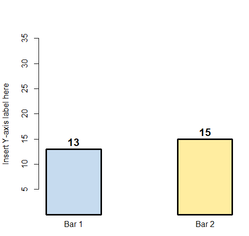
barp <- barplot(c(13, NA, 15),
ylim=c(1, 35),
names.arg = c("Bar 1", NA , "Bar 2"),
col= c(col.blu1, NA, col.blu2),
ylab = "Insert Y-axis label here")
text(barp, y = c(14.5, 0, 16.5), labels=c(13,NA, 15), font = 2, cex = 1.3)