Creating a barplot() from scratch using base R

So, I’m old school when it comes to plotting in R. Instead of relying on ggplot, I actually enjoy working with base R. I like the level of customization and, at the end of the day, I’m a bit nostalgic for the “old way” of doing things. To that end I wanted to post a quick note about how one can use base R to generate a barplot from scratch.

So, let’s say you’d like to display two bars, side-by-side, and chose custom colors (from the RColorBrewer package). One way you could go about doing it would be like so.


rm(list=ls())


require(RColorBrewer)

##

## Create custom barplot#

##


par(xpd=NA)

par(lwd=3)


# just in case you want to visualize a few color options

display.brewer.pal(9,name = "Blues")

display.brewer.pal(9,name = "YlOrRd")


# define barplot colors

col.blu1 <- brewer.pal(9,"Blues")[3]

col.blu2 <- brewer.pal(9,"Blues")[9]


# make your plot

par(lwd=3)

barp <- barplot(c(13, NA, 15),

ylim=c(1, 35),

names.arg = c("Bar 1", NA , "Bar 2"),

col= c(col.blu1, NA, col.blu2),

ylab = "Insert Y-axis label here")

text(barp, y = c(14.5, 0, 16.5), labels=c(13,NA, 15), font = 2, cex = 1.3)

Convert survival function back into survival object (hack)

I’ve been playing around with survival functions in R.  Just exploring and having fun with them.  In one case I was interested in fitting various parametric survival functions to data and I had someone at work obtain what was called internally “digitized” data that was extracted from the survival function of a published manuscript (it was a case where we could not obtain the actual raw survival data) and I wanted to play around with that digitized data to do some parametric curve fitting.

What became apparent at the outset was that many of the parametric fitting functions in R (in the flexsurv or survreg packages) require the user to create survival objects.  To convert the digitized data back into raw survival form, I had to create a hackish bit of code.  It is not perfect, but it appears to get the job done.

NOTE: I do not intend to do any analysis where I’m computing proportional hazards so the errors are NOT important to me, just the overall shapes of the survival functions and the ability to go interchangeably from digitized to raw from for survival curve fitting.

</span>

require(survival)
# generate the training data "lung1"
lung1 &lt;- lung[c("status", "time")]
nrow(lung1)# how many pts are in data

# from the training data build KM to obtain survival %s
s &lt;- Surv(time=lung1$time, event=lung1$status)
km.lung &lt;- survfit(s ~ 1, data=lung1)
plot(km.lung)

# the kind of data you might have if you have "digitized" data
# e.g., extracted from a journal
lungv2 &lt;- data.frame(time = km.lung$time, surv = km.lung$surv)

# hackish code that converts it back
# note you have to name columns "surv" and "time"
convert.surv &lt;- function( start.df, sample){
coh.n &lt;- sample
df1 &lt;- start.df[c("surv", "time")]
for(i in 1:nrow(df1)){
j &lt;- (nrow(df1)+1) - i
if( j == nrow(df1)){
repeats &lt;- df1[j, "surv"] * coh.n
repeats &lt;- round(repeats, 0)
s1 &lt;- rep(0, repeats)
t1 &lt;- rep(df1[j, "time"], repeats)
}
if (j != nrow(df1) &amp; j != 1){
repeats &lt;- (df1[j-1, "surv"] - df1[j, "surv"]) * coh.n
repeats &lt;- round(repeats, 0)
if( repeats == 0 )
next
if( repeats &gt; 0 ){
s1 &lt;- c(s1, rep(1, repeats))
t1 &lt;- c(t1, rep(df1[j, "time"], repeats))
}
}
if (j == 1){
repeats &lt;- ((1- df1[1, "surv"]) * coh.n)
repeats &lt;- round(repeats, 0)
s1 &lt;- c(s1, rep(1, repeats))
t1 &lt;- c(t1, rep(df1[j, "time"], repeats))
}
}
s1.r &lt;- rev(s1)
t1.r &lt;- rev(t1)
end.data &lt;&lt;- data.frame(time=t1.r, status=s1.r)  # place new df in global env
}

#try it out
convert.surv(lungv2, 228)

# lets make sure it works properly
s &lt;- Surv(time=end.data$time, event=end.data$status)
km.lung &lt;- survfit(s ~ 1, data=end.data)
plot(km.lung)

Changing and setting working directories in code

Welcome  to document management 2.0

Welcome to document management 2.0

As part of my work flow, I like to create directories in-code so that I can both: 1) document when I did/ran something and 2) ensure that all my work ends up in the same (correct) place. In the course of developing and evolving what has become my current work flow, I’ve made some mistakes along the way that I’ve learned from, and I figured it’s worth a quick post to put these down so others may learn from them as well.

Use case-So let’s say I’m doing an analysis on utilization of diabetes drugs, and seeing as how this is something that I run monthly for a particular client, I want to make sure that I’m documenting when I’m doing what and ensuring that it always ends up in the same place. How would that look?


###    First I like to set a "home base" which is a place I want to return to after I'm done
wd_or <- "C:/Users/myname/Documents" ## whatever your usual wd happens to be--mine is the My Documents folder

###    Then build a path to the directory of choice, I like to do this in code 
client.name <- "coporationA"
project.name <- "monthlydiabetes"
today.name <- gsub("-", ".", Sys.Date())
###    Then using dir.create() build the working directory --note you can only do this one step at a time--at first
###    For example, if you have not yet built the directory "corporationA" you cannot build a subdirectory within that directory
###    I know this may seem elementary, but it has tripped me up in the past (e.g., it's not dir*s*.create it's dir.create)

step1.dir <- paste(wd_or, Client.name, sep="/")
step2.subdir <- paste(project.name, today.name, sep="_")
##  step1 create director
dir.create(step1.dir)
##  step2 create subdirectory
dir.create(paste(step1.dir, step2.subdir, sep="/"))
setwd(paste(step1.dir, step2.subdir, sep="/"))

###    Now run whatever you want, then be sure to save your output
iris1 <- iris
iris1$newcol <- "iris"

iris2 <- iris
iris2$newcol <- "another_iris"


not_iris <- data.frame(V1=rep(1, 100), V2=rep(2, 100))

write.csv(iris1, file="iris1.csv", row.names=F)
write.csv(iris2, file="iris2.csv", row.names=F)
write.csv(not_iris, file="not_iris.csv")

###    Then after you're done it's always nice to tidy things up
setwd(wd_or)

Lastly, as a bonus, I’ve had some instances recently where, upon placing a set of files in a particular directory, I’ve had to grab only a select subset of those files and do things to those files. In a toy example, let’s say a week has passed since I created the 3 iris files above (iris1, iris2, and not_iris) and I now am required to go back into those files, append iris1 and iris2 into one file and do some analysis on the newly created big iris file.

Because I created a specific directory that contains only this work, my job is easy, and I can do it all from the console with code! 🙂


###    First, you must re-set the wd (use the old code file for that)

###    Take all this from the original code 
client.name <- "coporationA"
project.name <- "monthlydiabetes"

###    be sure to replace this with the date you ran the original analysis
today.name <- "2015.03.10"
step1.dir <- paste(wd_or, Client.name, sep="/")
step2.subdir <- paste(project.name, today.name, sep="_")

###    create a character vector of file names in that directory
file.names.look <- list.files(paste(step1.dir, step2.subdir, sep="/"))

###    select only those files that start with "iris" (e.g., you don't want "not_iris.csv")
subfile.names.look <- unique(file.names.look[ grep("^iris", file.names.look)])

###    you can do this a number of ways, but here's one way that involves a looping construct
list.temp.master <- list(NULL)
for(i in 1:length(subfile.names.look)){
    x.cols <- read.csv(paste(paste(step1.dir, step2.subdir, sep="/"), subfile.names.look[i], sep="/"), header=T, sep="|", nrow=1)
    x.col.classes <- rep("character" , length(x.cols))## I always declare col.classes as character because leading zeros have got me into trouble before (e.g., NDCs and SSNs)!
    df.import <-  read.delim(paste(getwd(), subfile.names.look[i], sep="/"), header=T, sep="|", colClasses = x.col.classes)
    list.temp.master <- c(list.temp.master, list(df.import))
}
list.temp.master <- list.temp.master[-1]

### create the newly appended big iris file
all.iris <- (do.call("rbind", list.temp.master))

### then do whatever analysis you want
mean(all.iris$Sepal.Length)

writing from r to excel (6*1) <-one or (0.5*12) <-other

Willie knows...

Willie knows…

Many clients or coworkers will prefer you provide any analytic output in excel (vs. fixed-width or *.csv), and so it is wise to have a bag of tricks that includes the ability to output work product in Excel. One powerful side-effect of doing so is that you can output multiple tables as separate tabs within the same worksheet. That is what the example code chunk below allows you to do. The chunk below leans heavily upon the work of others that I came across over the years. It requires the use of the xlsx package.

To give credit where it is rightfully due, look to the following:

Rob Kabakof wrote a helpful post about this here:http://statmethods.wordpress.com/2014/06/19/quickly-export-multiple-r-objects-to-an-excel-workbook/

There’s also an impressive implementation (which pulls in visualizations here):http://tradeblotter.wordpress.com/2013/05/02/writing-from-r-to-excel-with-xlsx/

My example chunk follows:

save.xlsx <- function (file, sheetnames, …)
{
require(xlsx, quietly = TRUE)
objects <- list(…)
objnames <- sheetnames
nobjects <- length(objects)
for (i in 1:nobjects) {
if (i == 1)
write.xlsx(objects[[i]], file, sheetName = sheetnames[i], row.names=FALSE)
else write.xlsx(objects[[i]], file, sheetName = sheetnames[i],
append = TRUE, row.names=FALSE)
}
print(paste('Workbook', file, 'has', nobjects, 'worksheets.'))
}
 
save.xlsx('myworkbook.xlsx', c('Tab1', 'Tab2', 'Tab3', 'Tab4') ,mtcars, Titanic, AirPassengers, state.x77)

Comment characters and importing data with read.xxx functions in R… Lost in Translation?

Sometimes google translate just doesn't do it for you

Sometimes google translate just doesn’t do it for you

Work has been busy, so I’ve had to take a quick break from blogging, but I recently stubbed my toe on something I wanted to quickly pen a post about.

I was importing some MediSpan data (HCPCS Code file) for a claims analysis and I was having an issue with my import script throwing an error that looked something like this:

NOTE: I’ll have to apologize in advance. I’m having an issue with html translating my quotes into directional quotes. I’m sure it’s more user error than anything, but be warned that you may have to change these back before your code will work in R.

xnames <- tolower(gsub(' |-’, ‘\\.’, str_trim((hcpdict[ grep(‘^M’, hcpdict$field.identifier), ‘field.description’]))))
xwidth <- (hcpdict[ grep(‘^M’, hcpdict$field.identifier), ‘field.length’])
xcolclasses <- (hcpdict[ grep(‘^M’, hcpdict$field.identifier), ‘field.type’])
xcolclasses <- ifelse(xcolclasses == 'C', ‘character’, xcolclasses)
xcolclasses <- ifelse(xcolclasses == 'N', ‘numeric’, xcolclasses)
hcpcode <- read.fwf(‘C:\\Users\\Chris.Conner\\Documents\\CI\\Lego_pie\\rawdat\\DIDB\\HCPCS\\HCPCODE’, widths = xwidth, col.names = xnames, colClasses=xcolclasses)


# Error in scan(file, what, nmax, sep, dec, quote, skip, nlines, na.strings,  : 
# line 2739 did not have 19 elements

A quick inspection of the raw file, and I surmised that it was a pound symbol “#” throwing things off. Essentially, R reserves this symbol for comments, even within files that you are importing with any of the read.xxx functions.

A quick search uncovered this excellent post that showed me the way out of my jam. I appended my code and viola(!) all fixed.

xnames <- tolower(gsub(‘ |-’, ‘\\.’, str_trim((hcpdict[ grep(‘^M’, hcpdict$field.identifier), ‘field.description’]))))
xwidth <- (hcpdict[ grep(‘^M’, hcpdict$field.identifier), ‘field.length’])
xcolclasses <- (hcpdict[ grep(‘^M’, hcpdict$field.identifier), ‘field.type’])
xcolclasses <- ifelse(xcolclasses == 'C', ‘character’, xcolclasses)
xcolclasses <- ifelse(xcolclasses == 'N', ‘numeric’, xcolclasses)
hcpcode <- read.fwf(‘C:\\Users\\Chris.Conner\\Documents\\CI\\Lego_pie\\rawdat\\DIDB\\HCPCS\\HCPCODE’, widths = xwidth, col.names = xnames, colClasses=xcolclasses, , comment.char=‘‘)

What is the true underlying functional form of the relationship between LDL and CV events in secondary prevention?

Take it from a true bonehead (just ask my wife or kids...)

Take it from a true bonehead (just ask my wife or kids…)

As I mentioned in an earlier post, I’ve spent some time thinking about the relationship between low density lipoprotien (LDL)–or bad cholesterol–and CV events.  Now that I’ve got a few minutes to spare and the kids are in bed, it’s about time I organize those thoughts and pen a second post (in a three–or maybe four–post series) about them.

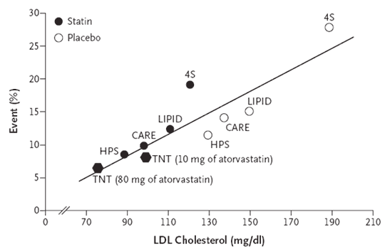
In my previous post, I extracted some data from previously published studies and recreated, what I consider to be, one of the most prolific meta-visualizations of trial evidence in cardiovascular disease. To be perfectly honest, my reasons for doing so were not just to have fun with R (I know–it’s a sickness), but to explore the underlying functional form of the model itself. To be specific, the TNT authors and at least one other analyses of similar data appear to all make the same assumption with respect to the linearity of the relationship between LDL and CV events (i.e., not only is lower better, but lower is better at a constant rate). In my review of the literature–which I will admit, may not be the most extensive–I could find only one report from the Cleveland Clinic Journal of Medicine which clearly suggested a nonlinear relationship between LDL and CV events (albeit across a mixture of primary and secondary prevention studies).

Practically speaking, the assumption of linearity may not result in any issues so long as readers confine their interpretations to a “reasonable” range of LDL levels, and practice caution not to extrapolate beyond the range of evaluated LDL values; however, newer–yet to be marketed–cholesterol lowering agents may make it possible for clinicians to take patient LDL levels to lows not readily achieved with any existing medications. In trying to assess the value of these new cholesterol lowering medications (provided they make it to approval), reimbursement agencies and health technology assessment organizations will have to rely on modeling to evaluate the long term clinical benefits. As a health outcomes researcher, I am acutely aware of how assumptions like the one I mention above can substantially alter the outcome of any modeling exercises. Especially in cases that depend on extraplating beyond the bounds of which you have data, ensuring you have the right model is extremely important.  For this reason, it is vial that we re-consider the implied assumption of linearity and at the very least apply sensitivity analyses when modeling any outcomes dependent upon the relationship of LDL  and CV events.

Since my previous post, I’ve extracted data from a few more secondary prevention trials (PROVE-IT and IDEAL). For the most part, the outcomes extracted include only those that captured CV death or non-fatal MI. You may notice that I did not include AtoZ. This was an intentional omission as the composite end point in this trial included hospital readmission for ACS.

First, take a look at the bivariate plot of LDL to CV events. Through this plot, you will notice that I have drawn both the OLS regression line (black solid) AND the quadratic regression line (red hashed).

options(stringsAsFactors)
library(RColorBrewer)
file <- "http://dl.dropboxusercontent.com/u/27644144/secprevstatin.csv"
statins <- read.csv(file, header=T) # read raw data from dropbox
statins <- statins[ which(statins$Study != “AtoZ”),] # remove AtoZ
statins$year <- as.numeric(substr(statins$lastrand, 1, 4)) + round(as.numeric(substr(statins$lastrand, 5, 6))/13, 2) # code year -- to be used later as feature

df1 <- statins
yval <- 'eventrate'
pyval <- 'Event (%)'
xval <- 'LDL'
pxval <- 'LDL Cholesterol (mg/dL)'
par(mar=c(5.1, 4.1, 4.1, 12))
df1$pchvec <- ifelse( grepl(“PBO”, df1$Cohort), 1, 19 )
plot( df1[, xval], df1[, yval], type=“n”, ylim=c(0,30), xlim=c(40,210), yaxt='n', xaxt='n', ylab=““, xlab=““)
u <- par(“usr”)
rect(u[1], u[3], u[2], u[4], col = “grey95”, border = “black”)
par(new=T)
abline(h = c(0, 5, 10, 15, 20, 25, 30), col='white', lwd=2) ##  draw h lines
abline(v = c(50,70, 90, 110, 130, 150, 170, 190, 210), col='white', lwd=2) ##  draw v lines
par(new=T)
plot( df1[, xval], df1[, yval], pch=df1$pchvec, col= cpal , bg= df1$pchfill, cex=1.5  ,yaxt='n', xaxt='n', ylab=““, xlab=““, ylim=c(0,30), xlim=c(40,210), lwd=2)
axis(side=2, at=c(0, 5, 10, 15, 20, 25, 30), labels=c(“0”,”5”,'10', '15', '20', '25', '30'), las=1 )
axis(side=1, at=c(50, 70, 90, 110, 130, 150, 170, 190, 210), labels=c(“50” , “70”, “90”, “110”, “130”, “150”, “170”, “190”, “210”)  )
legend( “topleft”, pch=c(19, 1), legend=c(“Statin”, “Placebo”), cex=1.2, border= “n”, bty='n')
text(df1[, xval], df1[, yval], labels = df1$Study, pos = 3, font=2, col=cpal)
title(main=“Event Rates Plotted against LDL Cholesterol Levels\nduring Statin Therapy in Secondary-Prevention Studies 4S to PROVE-IT.”, ylab=pyval, xlab=pxval)
abline(lm(df1$eventrate~df1$LDL), lwd=2)
poly.plot <- lm(eventrate~poly(LDL, 2), data=df1)
poly.pred <- predict(poly.plot, df1[xval])
preddf <- data.frame(x = df1[,xval], y=poly.pred)
preddf <- preddf[ order(preddf$x),]
lines(x=preddf$x, y=preddf$y, type=“l”, col=“red”, lwd=3, lty=2)
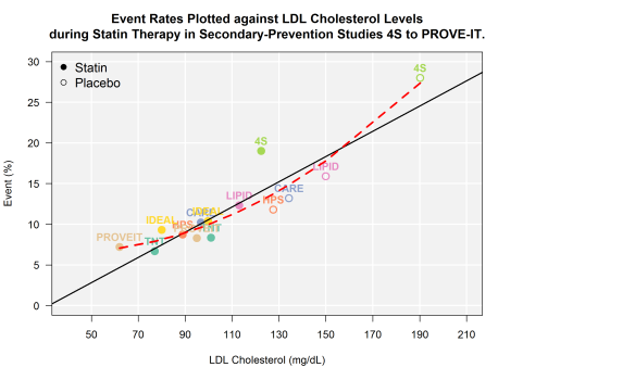

From 4S to PROVE-IT

From 4S to PROVE-IT

Next, let’s estimate the RMSE for the linear and quadratic functions.

lmmod <- lm(eventrate~LDL, data=statins)
poly <- lm(eventrate~poly(LDL, 2), data=statins)

lmpred <- predict(lmmod, statins)
lmquad <- predict(poly, statins)

rmse.linear <- sqrt(mean((statins$eventrate-lmpred)^2))
rmse.quad <- sqrt(mean((statins$eventrate-lmquad )^2))
rmse.linear
#[1] 2.339196
rmse.quad
#[1] 1.994463

While I walked through the steps, it should come as no surprise that the model with more parameters did a better job fitting the data. The question now is: did the quadratic model overfit the data? Some additional interesting questions might be to consider how valid it might be to include some of the older studies (e.g., 4S) in an analysis like this? When the 4S trial was conducted, many advances in the pharmacologic treatment of high blood pressure and other risk factors known to reduce the risk of a second heart attack were yet to become part of common clinical practice (e.g., post-MI discharge order sets including BB, ACE/ARB, and antiplatelet therapy). Is there a way to use statistics to support removing 4S from our analysis? To take a stab at answering those questions and more, I will walk through some additional analyses in my next 2 or so posts.

Cleaning up unruly data – flattening a delimited column of composite string data

While there may be more  efficient ways of eating watermelon, there are none quite as entertaining...

While there may be more efficient ways of eating watermelon, there are none quite as entertaining…

I found myself dealing with some exceptionally unruly data that was part of a clinical table. There was something about my predicament that had me wondering why I had not stubbed my toe on such an issue earlier. The elegance of the solution–and the knowledge that this may come in handy again some time–prompted me to pen a quick post.

What I had was a table where there was one column that included multiple lookup values and those values were in a continuous string separated by commas. Such data is a nightmare to use in an analysis, but I can easily see how such a table would be created. This kind of a layout (entering string data in one cell, separated by commas) is intuitive to a clinician typing such a table into an excel spreadsheet.

To be specific, in my case, I was dealing with a table of drug and Jcode/HCPCS data where any one drug could correspond to multiple J/HCPCS codes. The column where the Jcodes/HCPCS codes resided contained cells that looked something like this: “ABC123, XYZ456, etc., etc.”. For my end product, I needed a table where each J/HCPCS code lived in it’s own cell next to the individual drug names (which could be listed multiple times).

I found this most excellent post on stackoverflow that led me out of my mess. Below I provide a toy example that illustrates how I implemented the solution myself.

Where the magic happens is in the use of sapply to return the individual lengths of each parsed string and how this vector of lengths is then part of a call to rep() using the vector of drug names. PURE.POETRY. I find it inspiring that just ONE LINE of code has the power to unmangle such a horrible mess. It highlights how useful list structures are and how they can be manipulated.

v1=c("drugA","drugB", "drugC")
v2=c("J1234, S5105", "J8499", "12345, J9999, X5555")
df = data.frame(drugs = v1 , hcpcs.jcodes = v2)
df

codes <- strsplit(df$hcpcs.jcodes, &quot;, &quot;)
data.frame(drugs = rep(df$drugs, sapply(codes, length)), jcodes.hcpcs = unlist(codes))#... magic happens here!

Recreating one of the most reproduced plots in the history of hypercholesterolemia clinical trails (using R)

The one-and-only Figure 4. from LaRossa et al.

The one-and-only Figure 4. from LaRossa et al.

VS.

Statins... Saving lives since 1987.

Statins… Saving lives since 1987.

What you are looking at is quite possibly the most replicated statin study data visualization of all time. If you have been to more than one lecture on either primary-or-secondary prevention with statins, you’ve seen this plot, or some adaptation. It comes from page 1434 of the New England Journal of Medicine volume 352, issue 14. It was used in the discussion section by the authors of the TNT trial (LaRosa et al. N Engl J Med. 2005 Apr 7;352(14):1425-35.) to put the results of TNT into the broader context of the extant secondary prevention literature of the day. I’ve been thinking a lot about these data recently (for reasons which I’ll leave for another post), and wanted to manipulate some of it in R, and as a part of that exercise I decided to re-create (as best I could using only data form the published trials) and perhaps improve upon the plot.

options(stringsAsFactors=F, scipen=999)
library(ggplot2)
library(RColorBrewer)
file <- "http://dl.dropboxusercontent.com/u/27644144/secprevstatin.csv" # data is here--I extracted it the best I could from the various landmark trials
statins <- read.csv(file, header=T)
#View(secprevstatin)

##  slightly tweaked (I think this just looks better)

df1 <- statins
yval <- 'eventrate'
pyval <- 'Event (%)'
xval <- 'LDL'
pxval <- 'LDL Cholesterol (mg/dL)'

##  slightly tweaked (I think this just looks better)
par(mar=c(5.1, 4.1, 4.1, 12))
df1$pchvec <- ifelse( grepl("PBO", df1$Cohort), 1, 19 )
plot( df1[, xval], df1[, yval], type="n", ylim=c(0,30), xlim=c(40,210), yaxt='n', xaxt='n', ylab="", xlab="")
u <- par("usr")
rect(u[1], u[3], u[2], u[4], col = "grey95", border = "black")
par(new=T)
abline(h = c(0, 5, 10, 15, 20, 25, 30), col='white', lwd=2) ##  draw h lines
abline(v = c(50,70, 90, 110, 130, 150, 170, 190, 210), col='white', lwd=2) ##  draw v lines
par(new=T)
plot( df1[, xval], df1[, yval], pch=df1$pchvec, col= cpal , bg= df1$pchfill, cex=1.5  ,yaxt='n', xaxt='n', ylab="", xlab="", ylim=c(0,30), xlim=c(40,210), lwd=2)
axis(side=2, at=c(0, 5, 10, 15, 20, 25, 30), labels=c("0","5",'10', '15', '20', '25', '30'), las=1 )
axis(side=1, at=c(50, 70, 90, 110, 130, 150, 170, 190, 210), labels=c("50" , "70", "90", "110", "130", "150", "170", "190", "210")  )
legend( "topleft", pch=c(19, 1), legend=c("Statin", "Placebo"), cex=1.2, border= "n", bty='n')
text(df1[, xval], df1[, yval], labels = df1$Study, pos = 3, font=2, col=cpal)
title(main="Figure 4. Event Rates Plotted against LDL Cholesterol Levels\nduring Statin Therapy in Secondary-Prevention Studies.", ylab=pyval, xlab=pxval)
abline(lm(df1$eventrate~df1$LDL), lwd=2)
poly.plot <- lm(eventrate~poly(LDL, 2), data=df1)
poly.pred <- predict(poly.plot, df1[xval])
preddf <- data.frame(x = df1[,xval], y=poly.pred)
preddf <- preddf[ order(preddf$x),]
lines(x=preddf$x, y=preddf$y, type="l", col="red", lwd=3, lty=2)

Predicting 10-year CV risk with Framingham data using logistic regression: The ‘good old’ way vs. LASSO–two competing models

When models compete... it sometimes is just plain ridiculous.

When models compete… it sometimes is just plain ridiculous.

breakdancefight

I have recently been thinking a lot about both CV risk modeling (esp. given some of the controversy the newest ATP 10-year ASCVD risk calculator has ignited) and regression methods with cross-validation. Now, putting the particular debate around the newer ATP 10-year risk modeler aside, I found myself wondering how different ways of applying regression methods to a problem can result in models with different predictive performance. Specifically, what I’m referring to is comparing the performance of the ‘good old’ method of model selection–and by that I mean the way I was taught to apply it in graduate school–to a ‘newer’ regression shrinkage method (like LR with lasso). Now, when I say the “good old” way, I’m referring to a method that involves: 1) throwing all the features into the model, 2) evaluating the significance of each feature for selection, and 3) re-specifying the model with only those features you retained from step2. Also, while I might call LR with LASSO a ‘newer’ method, I realize that for many, there would be nothing novel about it at all.

One of the main reasons I am starting to develop a healthy skepticism about the traditional methods concerns ending up with models that contain many features, therefore resulting in models with high variance (and a sub-optimal bias-variance tradeoff). That makes a lot of intuitive sense to me; however, I’d love to be able to observe the difference as it would relate to a problem we might face in the health outcomes field. To that end, I’ve decided to apply both techniques to a cut of Framingham data. The main question being: Which model would do a better job at predicting 10-year CV risk? So, let’s put both methods to the test! May the best model win!

# load framingham dataset
options(stringsAsFactors=F)
framingham <- read.csv("~/R_folder/logreg/data/framingham.csv")
# remove observations with missing data for this example 
framingham <- na.omit(framingham)

# create test & training data
set.seed(1001)
testindex <- sample(1:nrow(framingham), round(.15*nrow(framingham), 0), replace=FALSE)
train <- framingham[-testindex, ]
test <-  framingham[testindex, ]

# first plain vanilla logistic regression (retaining only those variables that are statistically significant)
mod1 <- glm(TenYearCHD~., data=train, family="binomial")
summary(mod1) # retain only the features with p <0.05
vanilla <- glm(TenYearCHD~male+age+cigsPerDay+sysBP+glucose, data=train, family="binomial")

# use cv.lasso
# this method uses cross-validation to determine the optimal lambda 
# and therefore how many features to retain, and what coeffients
cv.lasso <- cv.glmnet(x.matrix, y.val, alpha=1, family="binomial")
plot(cv.lasso, xvar="lambda", label=TRUE)
coef(cv.lasso)

# assess accuracey of model derived from plain vanilla
# use your hold out test data
vanilla.prediction <- predict(vanilla, test, type="response")
# confusion matrix for plain vanilla log reg
table(test$TenYearCHD, vanilla.prediction >= 0.5)
# accuracy
mean(test$TenYearCHD == (vanilla.prediction >= 0.5))

# test lasso predictions
cv.lasso.prediction <- predict(cv.lasso, test.x.matrix, type="response")
# confusion matrix for lasso log reg with CV to choose lambda and best coefficients
table3 <- table(test$TenYearCHD, cv.lasso.prediction>=0.5 )
# accuaracy
mean(test$TenYearCHD == (cv.lasso.prediction>=0.5))

In this particular case, it appears to me that the old way produces a better model (accuracy of 0.842 vs. 0.838). While I’m not going to assume that this will always be the case, I had fun putting both models to the test!

Cleaning up detailed D.0 compound claim files–many columns of data into one cell

compound_medicinesOne of the burning client issues that I find I am focused on–as of late–is a disturbing increase in the proportion of very high cost compounded drug claims. While I am not going to spend any time debating the clinical value of these claims, I think anyone would agree that a good first step in forming an evidence-based approach to developing an opinion on these claims is to examine them (How many do you see? What do they cost? Does the costing basis make sense to you? What ingredients go into them? etc.,).

In the new D.0 claim format, compounding pharmacies are given the ‘opportunity’ to list each individual ingredient used to make up the compounded product. So one of the things you may want to do is take all of the line-by-line ingredients that make up a claim and create data where each set of ingredients are aggregated into one line. This is a helpful chunk of code that does just that. It makes use of both Hadley’s dcast() function–part of the reshape2 package, and the apply() function (one of a very handy set of _apply functions in R).

#Make some data
ingredient_name <- c("Drug A Phosphate Cap", "Flavor", "*Distilled Water*", 
"Drug X Inj Susp", "Lidocaine", 
"Super Drug HCl Liquid", "Not that great Inj Susp", 
"Antibiotic HCl Cap", "Drug A HCl Liquid", "Antifungal (Bulk)", 
"Table Salt Bicarbonate (Bulk)", "Antifungal (Bulk)", "Table Salt Bicarbonate (Bulk)", 
"Drug A Phosphate Cap", "Flavors", "*Distilled Water*", 
"Drug A Phosphate Cap", "Antifungal (Bulk)", "Table Salt Bicarbonate (Bulk)", 
"Super Drufg Acetonide Inj Susp", "Emollient**", 
"Antifungal (Bulk)", "Table Salt Bicarbonate (Bulk)")
 claim_id <- c(1, 1, 1, 2, 2, 2, 3, 3, 3, 4, 4, 5, 5, 6, 6, 6, 7, 8, 8, 9, 
9, 10, 10)
df1 <- data.frame(claim_id, ingredient_name)
#Let's look at what you have
df1
df2 <- dcast(df1, claim_id~ingredient_name)
#NOTE: fantastic side effect of dcast is that it alphabetizes columns by column name
#This ensures that for different claims the ordering of the ingredients follows the same rules!
cols <- names(df2)[-1]
df2$all_ingred <- apply( df2[ , cols ] , 1 , paste , collapse = ", " ) # combine all the columns into one
df2$all_ingred<- gsub("NA, |NA", "", df2$all_ingred)#clean up
df2$all_ingred<- gsub(", $", "", df2$all_ingred)#more clean up
df3 <- df2[c("claim_id", "all_ingred")]#even more clean up
#Now give it a look
df3